






The Ultimate Guide to Logo Placement on Shirt


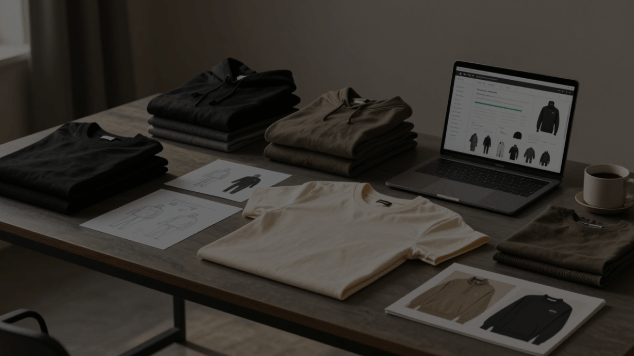
Choosing the right T-shirt logo placement can make a big difference in how your design looks, feels, and sells. A great custom T-shirt is not only about color, fabric, or fit—the position of your logo also plays a key role in creating a strong first impression.
In this T-shirt logo placement guide,we'll introduce 9 popular logo placements on shirt and recommend the best sizes, positions, and printing methods for each. Whether you’re creating branded apparel, team shirts, or custom merchandise, Tapstitch makes it easy to bring your T-shirt design ideas to life.
Why Is Logo Placement on a Shirt Important?
Logo placement can change the way a shirt looks and feels more than you might think. Even a small adjustment can change the overall vibe of the design — making it feel cleaner, bolder, more relaxed, or more professional. The right placement helps your logo stand out naturally without making the shirt look too busy.
For instance, a small logo on the left chest is a popular choice for company uniforms and branded merch because it feels simple and polished. A large print on the back creates a stronger visual statement, especially well-suited to event shirts, team apparel, or streetwear. Before deciding on placement, think about who will wear the shirt, where they’ll wear it, and the kind of impression you want your design to leave.
Different Types of T-Shirt Logo Placement
Below, we’ll explore 9 go-to T-shirt logo placement ideas to help you choose a position that makes your design look its best.
Full Front Logo Placement
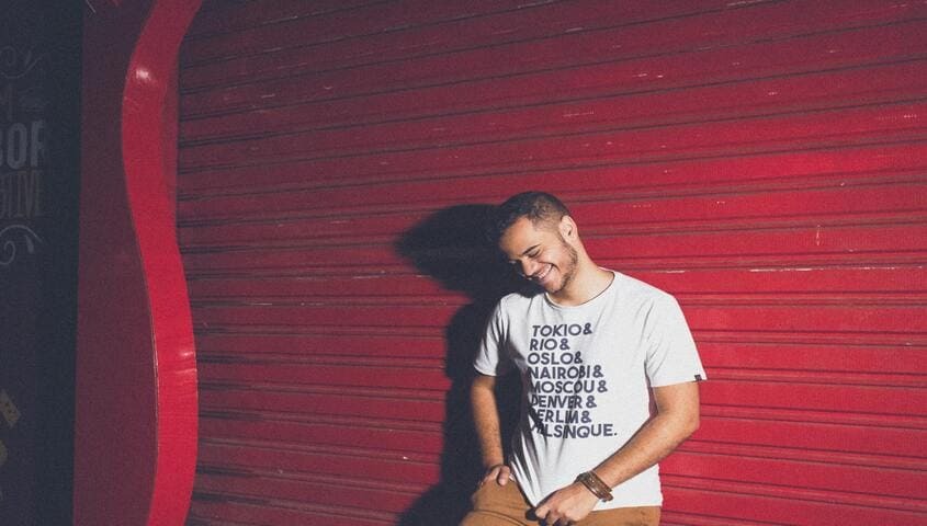
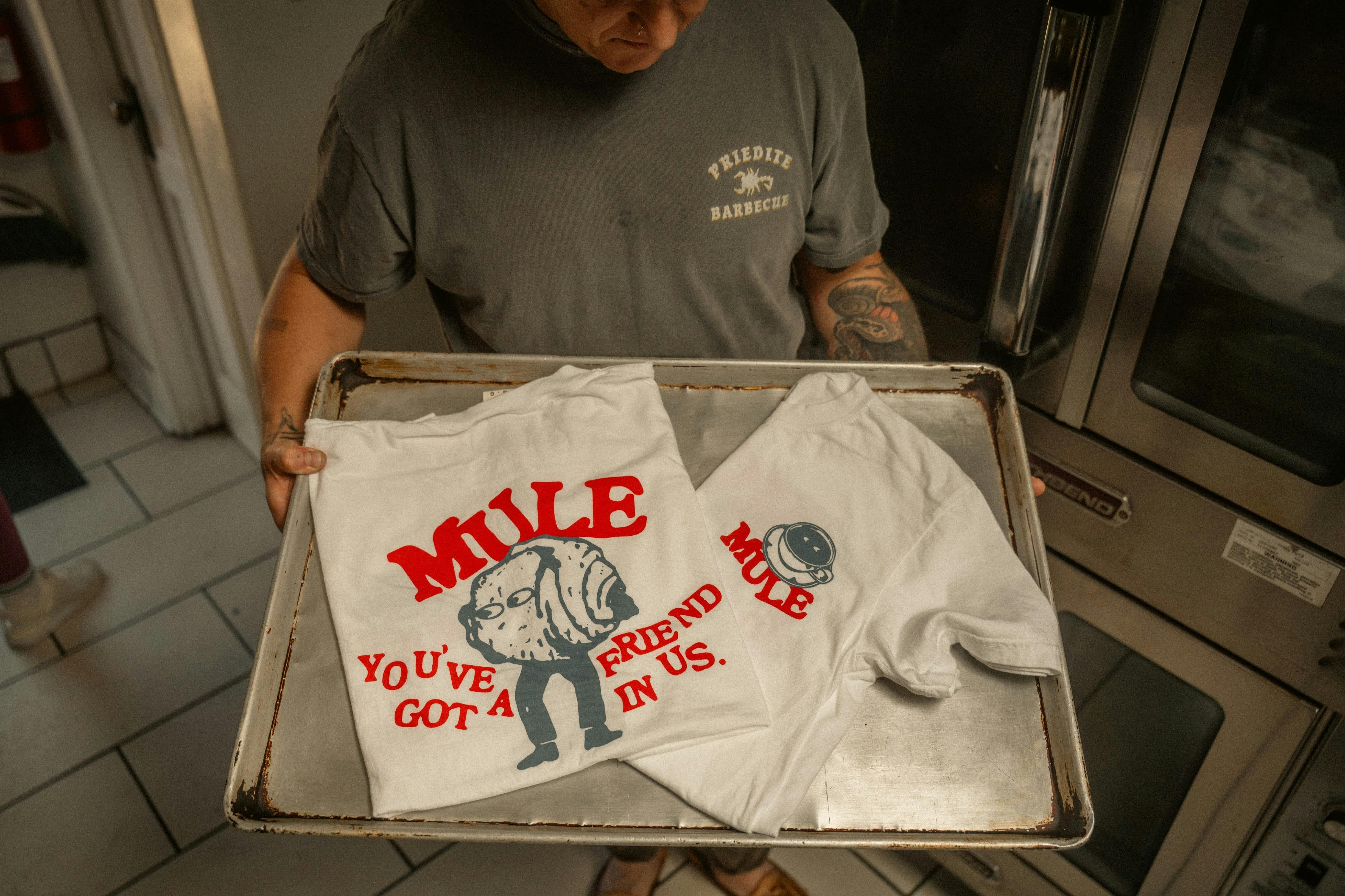
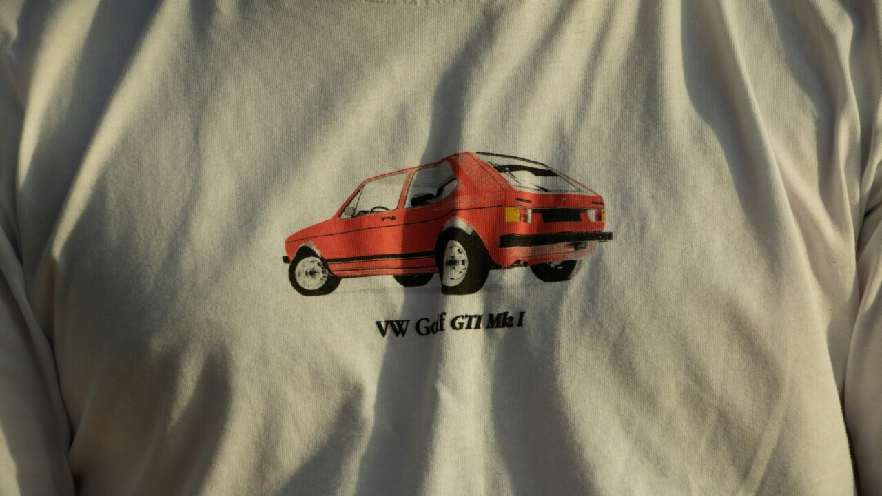
A full-front logo placement gives your design the most space to stand out on a T-shirt. Because the artwork sits right in the center front area, it’s a great option for bold graphics, brand logos, slogans, event designs, or anything you want people to notice immediately. If your goal is to make a strong first impression, full front placement is one of the most popular choices.
At the same time, giving a design more space doesn’t mean you should fill every inch of the shirt. Keeping the artwork balanced is what makes the final result look good. Recommended logo size for full front placement is around 12″ wide by 14″ high, with the design positioned about 3″ below the collar. Going too large can make the shirt feel overcrowded or visually too heavy. Placement height matters too — designs tend to look best when positioned around the upper or middle chest area rather than too low on the shirt. This keeps the print looking clean, comfortable, and easy to wear.
Left Chest Logo Placement
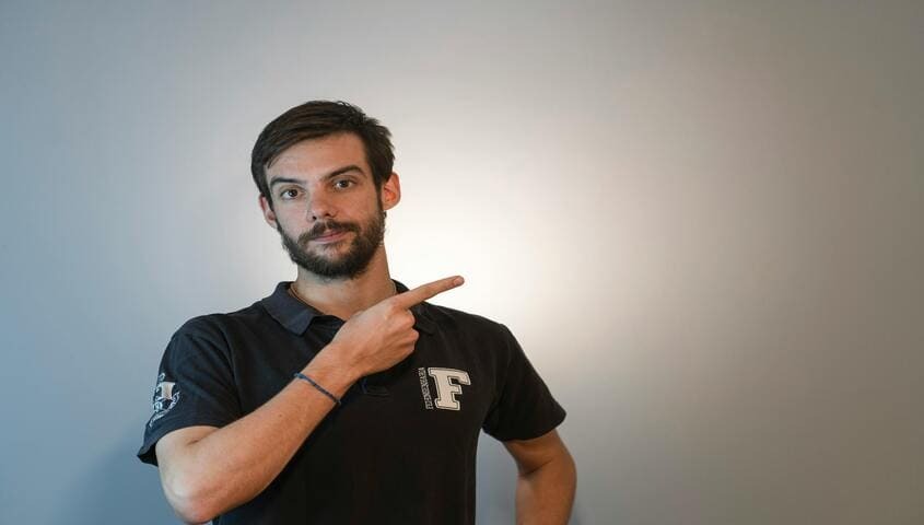
Left-chest logo placement is one of the most popular options for a clean, professional look. You’ll often see it used on staff shirts, branded merch, and event apparel because it keeps the design simple without making the shirt feel overly busy. Small logos, icons, and minimal brand marks usually fit best in this area.
When placing a logo on the left chest, positioning makes a big difference. A common guideline is to place the design about 3 inches below the collar and slightly centered between the sleeve and the shirt's middle. Since this area isn’t very large, smaller designs tend to look better — usually somewhere between 2.5″ × 2.5″ and 5″ × 5″. Clean, simple artwork works especially well here, while detailed graphics or tiny text can be difficult to read after printing.
Oversized Front Logo Placement

Oversized front placement is perfect for designs that are meant to stand out. With more print space across the front of the shirt, this style gives your artwork a bold, eye-catching look that draws attention instantly. It’s especially popular for large graphic prints, fashion brands, and statement designs that need a stronger visual impact than a standard front print.
The key to making an oversized design look good is keeping everything balanced. If the artwork wraps too far toward the sides, parts of the design can become harder to see once the shirt is worn. Instead of trying to fill every bit of space, focus on creating a layout that feels natural across the front of the tee. For most adult shirts, a width of around 13 to 16 inches usually works well. Keeping the design centered also helps the final print feel clean, intentional, and comfortable to wear rather than overly crowded.
Center Chest Logo Placement
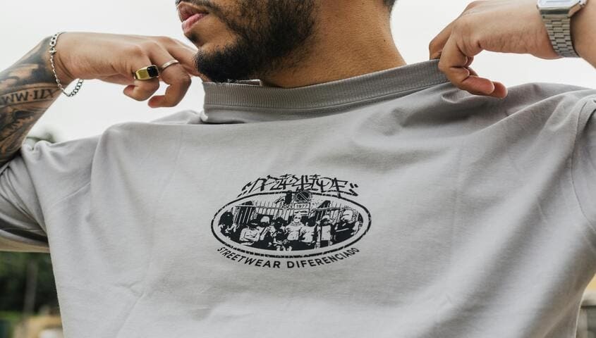
Center chest placement is one of the easiest and most versatile options for T-shirt designs. It works especially well for small logos, short text, or simple graphics that you want people to notice quickly without covering the entire shirt. Because the design sits right in the middle front area, it naturally catches attention while still keeping the overall look clean and wearable.
For most adult tees, center-chest designs usually look best when placed about 2.5 inches below the collar. A helpful tip is to line up the artwork with the collar rather than relying on the shirt's full width. Since fabric cuts and stitching can sometimes make one side look slightly different from the other, using the collar as your guide helps the design appear more centered once the shirt is actually worn. It’s a small detail, but it can make the final print look much cleaner and more professional.
Sleeve Logo Placement
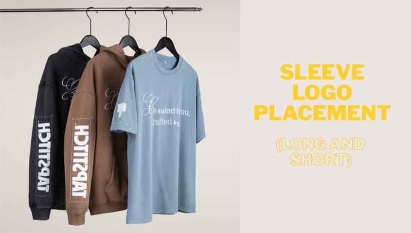
Sleeve logo placement is a subtle detail that can make a T-shirt design feel more thoughtful and unique. Some brands use sleeve prints on their own for a minimal look, while others pair them with front or back graphics to add a little more personality to the design. If you want to try sleeve printing, Tapstitch also offers this custom sleeve design. Here are two types of sleeve print placement.
Long Sleeve Placement
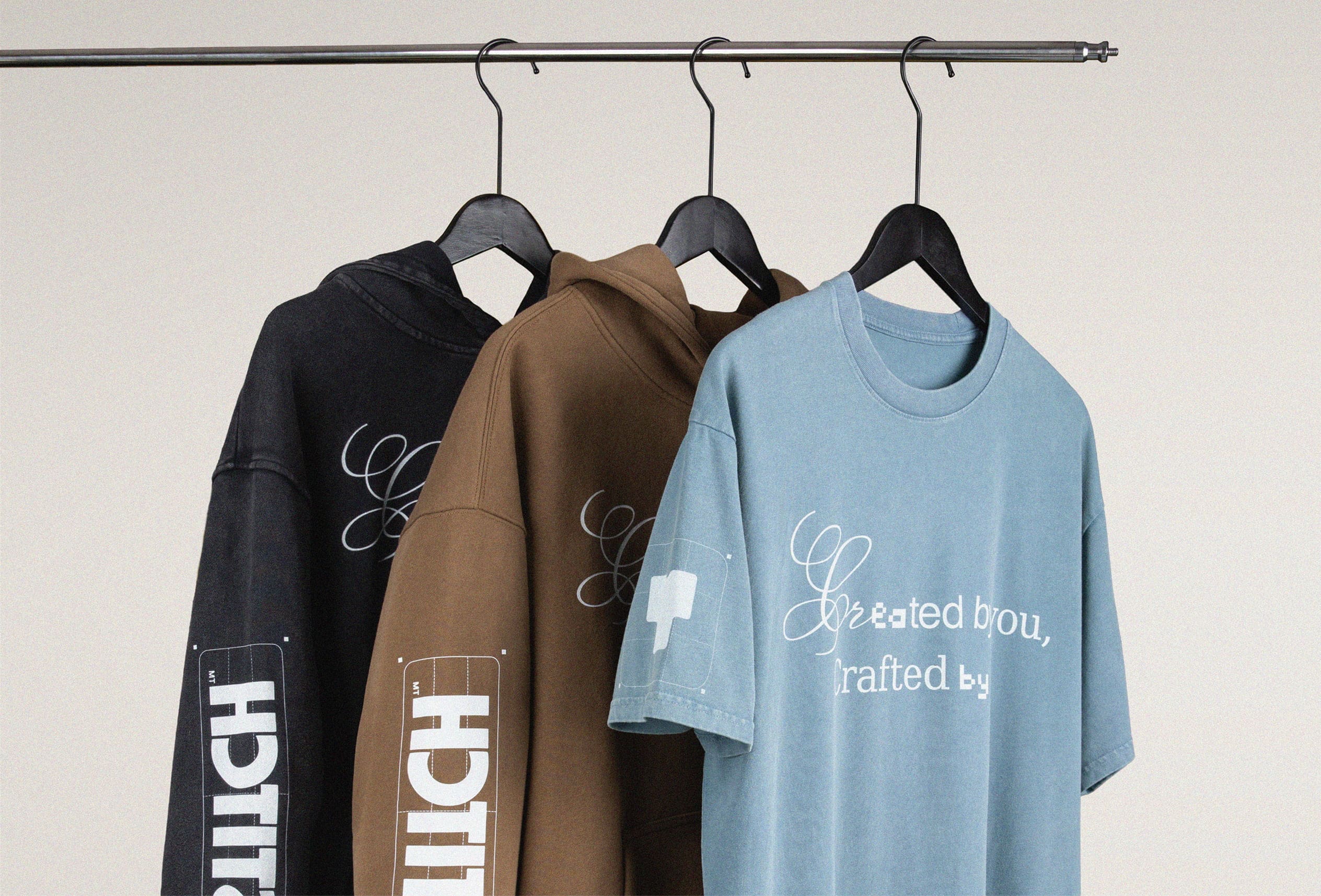
Long-sleeve logo placement can make a T-shirt design feel much more interesting without requiring a large graphic. It’s a popular choice for streetwear styles because the extra print along the sleeve adds movement and detail that you don’t get from a regular front print alone. Vertical text, small logos, simple artwork, or repeated graphics all tend to work really well in this area.
When designing for long sleeves, keeping the artwork narrow usually gives the best result. Most designs look balanced at around 2 to 3 inches wide, so they fit naturally along the arm without feeling oversized. It also helps to leave a little space near the sleeve seam — about 1 inch is usually enough to keep the print from looking cramped. If you’re adding text, choose a size and layout that remains easy to read once the sleeve is actually worn, since curved fabric can slightly alter how the design appears.
Short Sleeve Placement
Short-sleeve logo placement may be a smaller detail, but it can make a T-shirt look much more finished and intentional. It’s a great option for simple branding, minimal logos, short text, or custom apparel that needs a subtle professional touch. While the sleeve doesn’t offer as much space as the front or back of the shirt, choosing the right logo size for shirts can make a big difference in how clean and professional the final design looks.
Because the print area is fairly small, simple designs usually work best. Most sleeve graphics look clean at around 1 to 4 inches wide, and placing the artwork roughly 2 inches above the sleeve hem helps keep everything looking balanced and easy to notice without feeling crowded.
Full Back Logo Placement
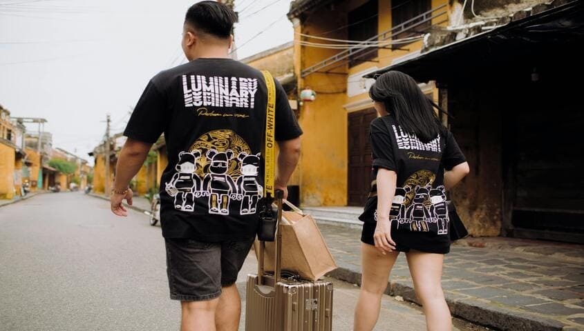
Back logo placement gives you a lot more room to work with, making it ideal for sports jerseys, event shirts, tour merch, and large graphic designs. If your artwork includes bold visuals, extra text, or more detailed elements, the back of the shirt usually provides enough space for everything to breathe without making the design feel cramped.
One thing that makes a big difference with back prints is positioning. Designs generally look better when they sit a little higher on the shirt rather than too close to the bottom. A common placement is around 2.5 to 4 inches below the collar, allowing the artwork to flow naturally down the back. This keeps the print looking balanced and easy to notice when worn. If you’re also adding a logo or graphic on the front, try to make both designs work together so the shirt feels cohesive instead of visually overloaded.
Back Collar Logo Placement
This logo placement sits right below the neckline on the back of the shirt. Some people also refer to this area as the “yoke,” especially in fashion and custom apparel design, but for most custom T-shirts, “back collar placement” is the more familiar term.
Because the space is fairly limited, simple artwork usually looks the cleanest here. Most back collar logos are around 2 to 3 inches wide, which keeps the design subtle but still noticeable. Placing the artwork about 1 inch below the collar generally gives the best balance and helps the print feel intentional without drawing too much attention away from the rest of the shirt design.
Upper Back Logo Placement
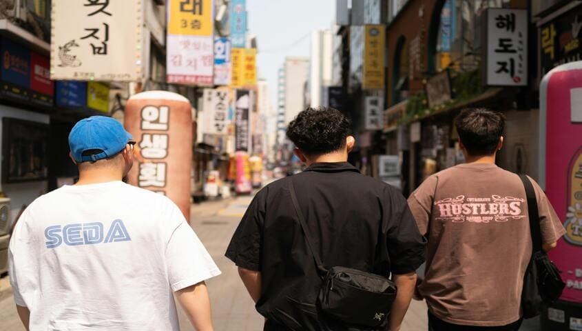
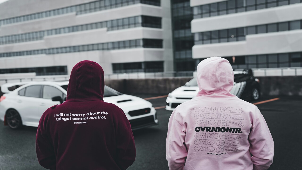
The area just below the back neckline is a great place for smaller branding details like a small slogan, social media handle, or a minimalist icon. If you want the design to stay visible and easy to read from a distance, a width of around 12 to 14 inches usually works well for larger back graphics.
It’s also completely normal for the back design to be bigger than the logo on the front. A smaller front print keeps the shirt looking clean and easy to wear, while a larger back graphic adds more visual impact and helps the design stand out more naturally.
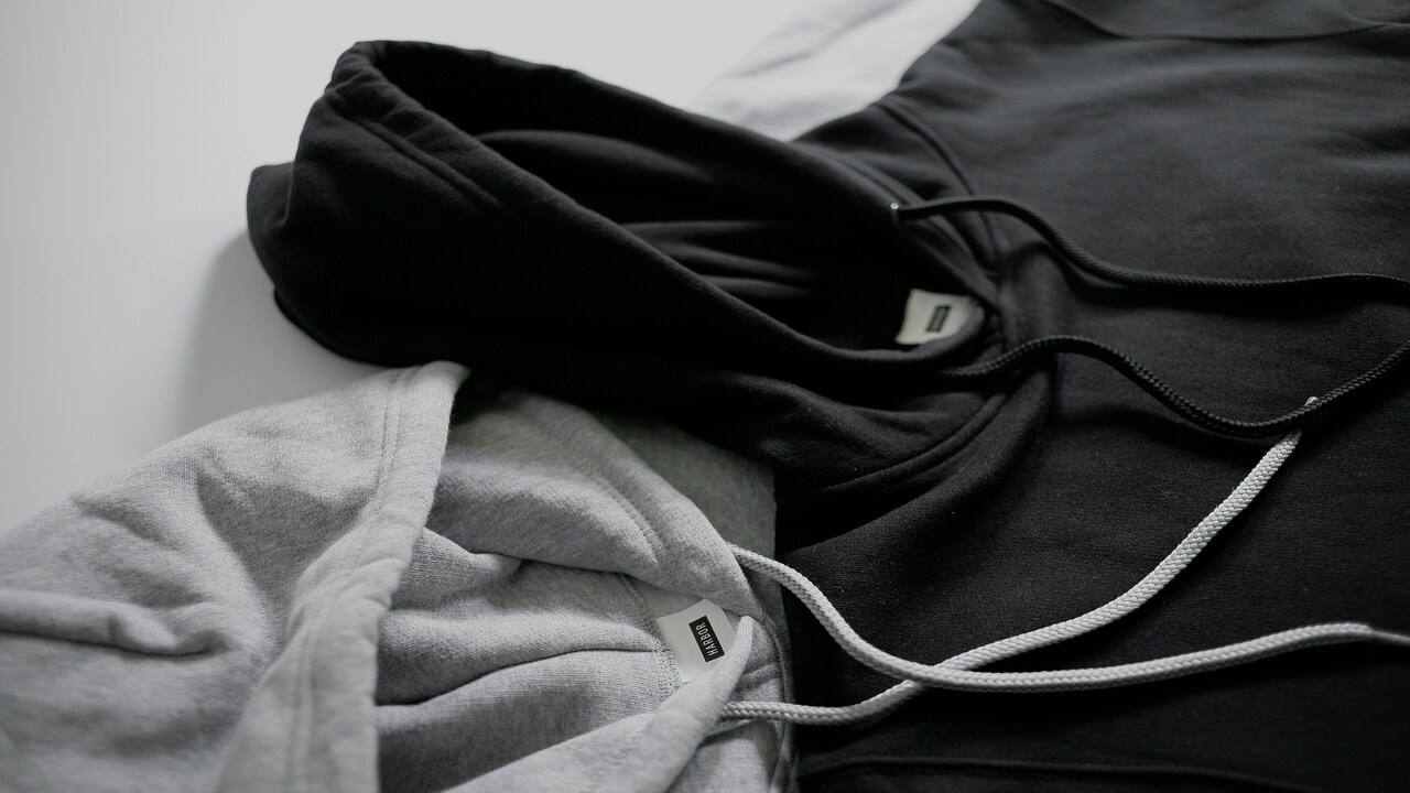
Label Logo Placement
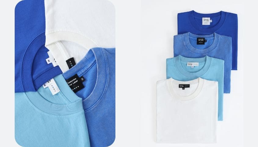
For print-on-demand sellers looking to make their apparel feel more branded and less generic, custom neck labels can make a surprisingly big difference. It’s a small detail, but it helps T-shirts look more polished and gives customers another reminder of your brand every time they wear the product. Over time, details like this can help create a more consistent brand identity and make your store easier for customers to remember.
Not every POD supplier offers custom label service, though. With Tapstitch, you can choose between two custom neck label sizes: Rectangle (0.8″ × 2.4″) and Square (1.6″ × 1.6″). There are also black and white label options available, making it easier to match the label style with your T-shirt design, branding, and overall aesthetic.
What to Consider Before Choosing Your T-Shirt Logo Placement
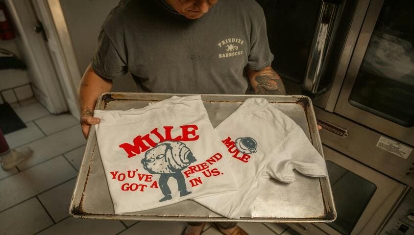
Before choosing your T-shirt logo placement, it helps to understand a few basics that can affect how your final T-shirt design looks and feels.
Logo Size for Shirts
A logo should look balanced on the shirt instead of feeling too large or too easy to miss. If the design takes up too much space, the shirt can start to feel visually heavy. On the other hand, a logo that’s too small may lose detail or become hard to notice, especially when text is involved. For most adult T-shirts, chest logos around 3 to 4 inches wide usually create a clean and comfortable look without making the design feel overcrowded.
Kids’ shirts need a little more adjustment since the fit and proportions are smaller. In many cases, logos between 2 and 3 inches wide work well, but the ideal size really depends on the actual garment. A toddler tee, youth size, and teen shirt won’t all scale the same way. The easiest rule to follow is to keep the logo easy to read and naturally proportioned to the size of the shirt.
Balance Other Placement
If your T-shirt design uses multiple print areas, try to make each element complement the others instead of making the shirt feel overloaded. A small front logo with a larger back graphic is a good example of a layout that feels balanced while still standing out. Adding a sleeve print can also bring in extra branding detail without taking too much attention away from the main design.
When combining different logo placements, it helps to think about how the shirt will look as a whole once someone is actually wearing it. Keeping enough spacing between designs and avoiding too many large graphics can make the final piece feel cleaner, more wearable, and more professionally designed.
Best Printing Methods for T-Shirt Logo Placement
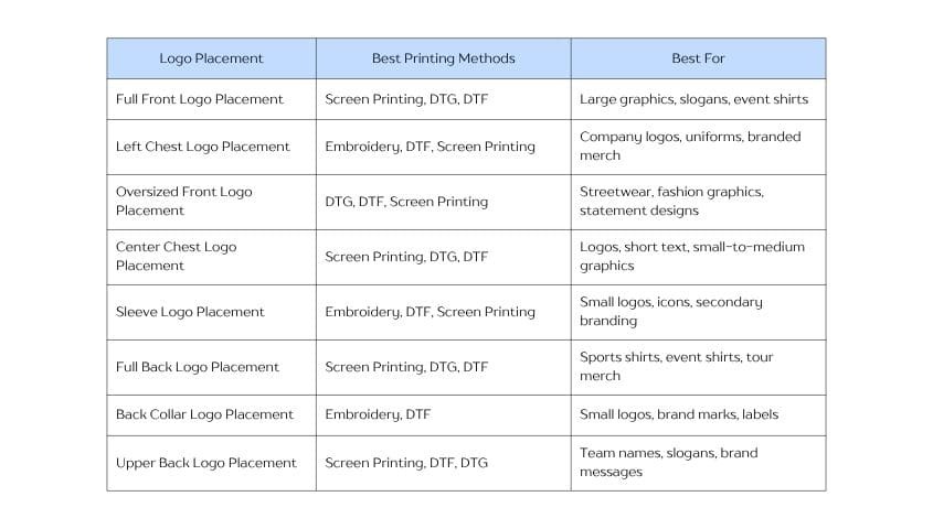
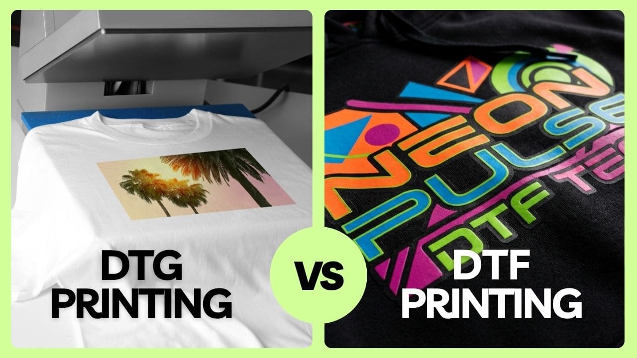
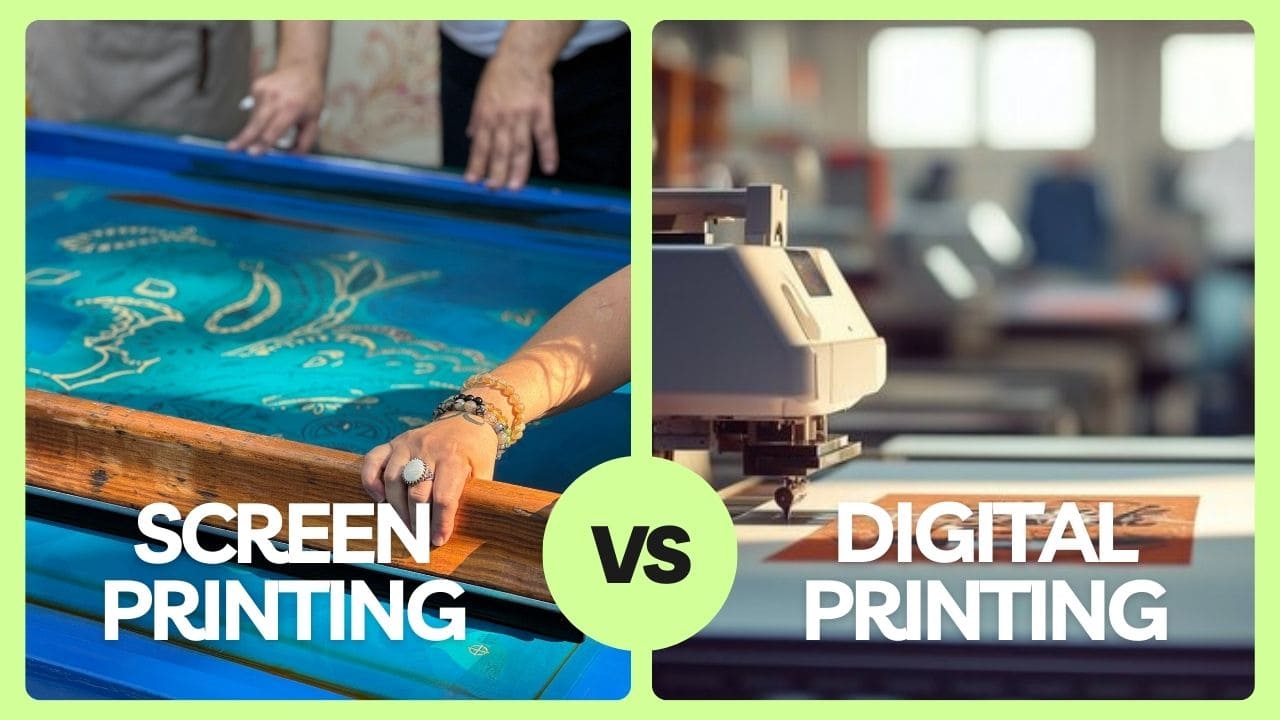
Different print areas work better with different types of shirt printing, so picking the right combination can help your design look cleaner, last longer. The chart below breaks down which printing methods work best for each logo placement.
How to Design Custom Tshirts with Tapstitch
Designing custom shirts with a print-on-demand model is a simple and low-cost way to bring your ideas to life. As a POD supplier offering printing, packing, and global shipping services, Tapstitch helps you create custom T-shirts without having to manage production on your own. Here’s how to get started:
1. Create a free Tapstitch account
Sign up for a free Tapstitch account to start designing your custom apparel.
2. Choose a T-shirt from Tapstitch’s catalog
Browse Tapstitch’s catalog of 700+ products and choose a T-shirt that fits your design style, target audience, and brand needs. If you want to create a sleeve print, go to the catalog page and select “Sleeve” under “Print Area” to view products that support sleeve printing.
3. Upload and customize your design
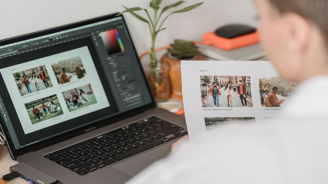
Use Tapstitch’s built-in design tool to upload your artwork and adjust the placement. You can also use helpful features such as background removal, font options, and mockup previews to see how your print will look before placing an order.
4. Place your order
Tapstitch will then handle the printing, packing, and shipping process, making it easier to create custom T-shirts without managing production on your own.
5. Receive your custom T-shirt
After production and delivery, your custom shirt will arrive ready to wear, sell, or share with your customers.
FAQs: Logo Placement Guide
What are the common mistakes for beginners?
Common beginner mistakes include choosing the wrong logo size, placing the design too high or too low, using overly detailed artwork in small print areas, and not checking the mockup before ordering. To avoid these issues, always review the print area, logo placement, and design size before production.
How do I choose the best logo placement for my custom design?
Choose your logo placement based on your design size, brand style, and shirt purpose. Small logos work well on the left chest, sleeve, or back collar, while larger graphics are better for full front, oversized front, or back placements. Always check the mockup to make sure the design looks balanced before ordering.
To Summarize: T-shirt Design Placement Guide
Logo placement can change the whole feel of a T-shirt. With this T-shirt design placement guide, you can choose a position that makes your design look clear, balanced, and true to your brand style.
Before placing an order, take a moment to check the logo size, print area, and mockup preview. With Tapstitch, you can test different placements and create custom T-shirts that look good from every angle.
.png)

.jpg)
.jpg)
.jpg)
.jpg)
.jpg)
.jpg)







.png)



.png)
.webp)

.jpg)








.jpg)



.jpg)

.png)
.jpg)


.jpg)
.jpg)




.jpg)
.jpg)
.jpg)
.jpg)
.jpg)

%20(1).jpg)

.png)

.png)


%20(1)%20(1).jpg)






.png)
.png)


.jpg)

.jpg)
.jpg)