
Recent Searches
Popular Searches

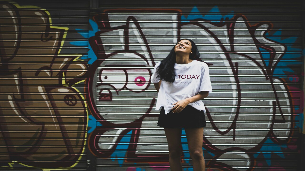
T-Shirt Design Placement Guide 2026: Sizing & Positioning Breakdown
.jpg)
A t-shirt design lives or dies by placement. Too low on the chest, and it feels clumsy. Too oversized and it slips into novelty merch. But the right design size for shirts and the right logo size for shirts can flip the same graphic into something people don't just admire but want to wear.
This t-shirt design placement guide breaks it down for 2026: scaling rules, measurement hacks, and the placements driving today’s streetwear trends. Get it right, and your design becomes a staple after the first wear.
Key Placement Zones to Know
Every shirt has natural “zones” where the eye expects to see a design. Master those zones, and you’re not just following a shirt placement guide—you’re writing in the language of fashion. Miss them, and even the hottest artwork can come out like a bootleg t-shirt from a gas station rack.
Front Placements
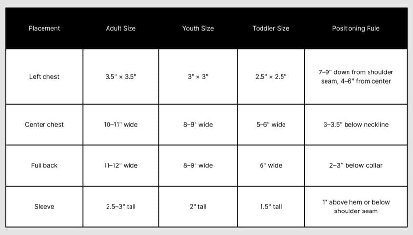
Left Chest → The classic logo spot. Small, subtle, versatile. Think under 4" wide—perfect for a brand mark, minimal streetwear, or that logo size for shirts that whispers instead of shouts.
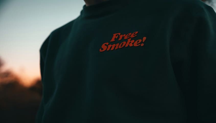
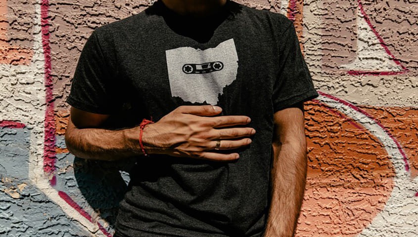
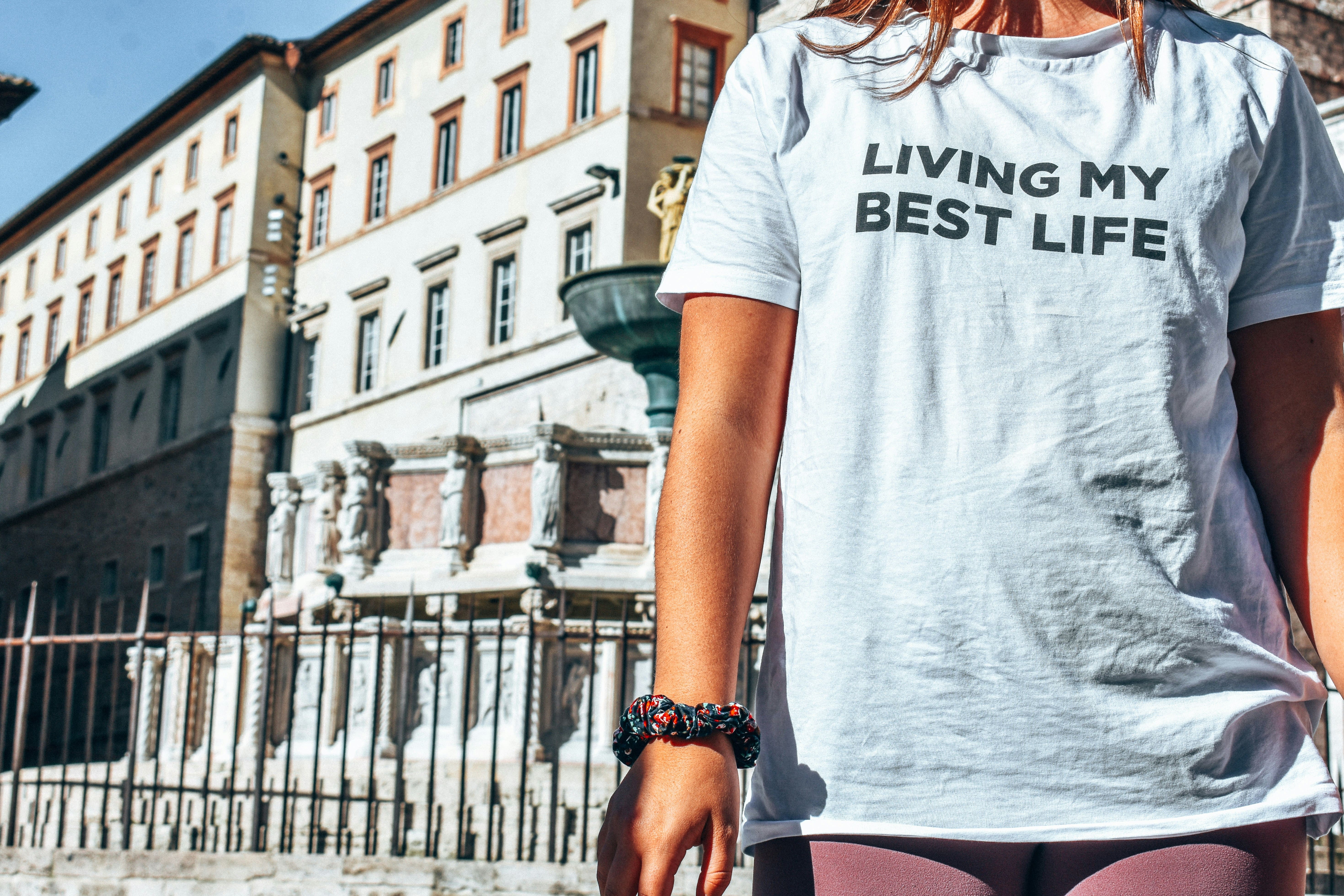
Center Chest → Balanced but bigger. Text slogans, mid-sized graphics, 3"–4" under the collar. It’s the ad-lib of placements—quick, sharp, and unforgettable.
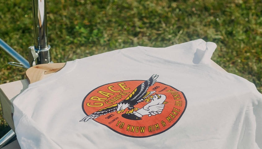
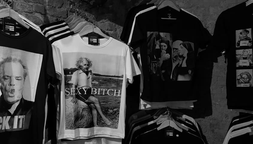
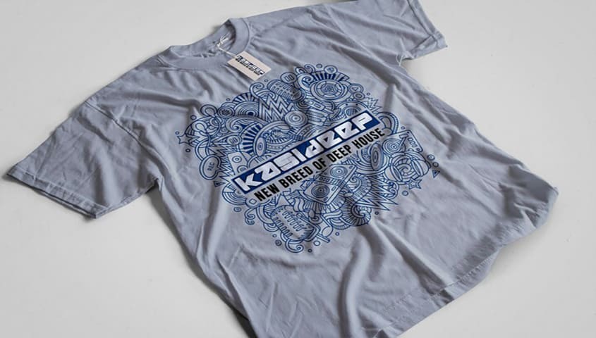
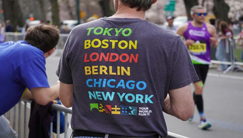
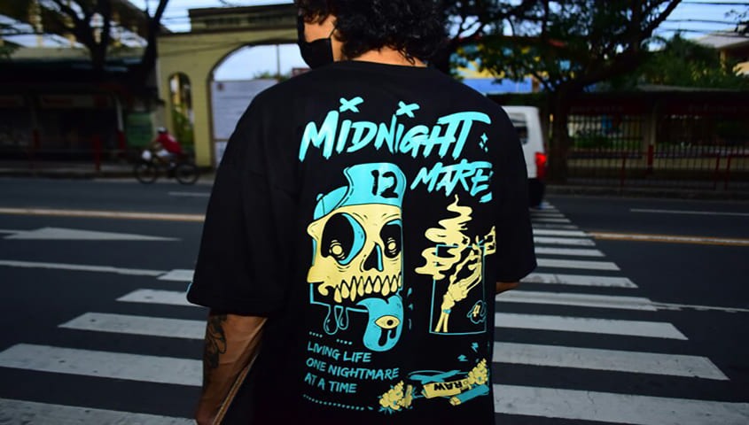
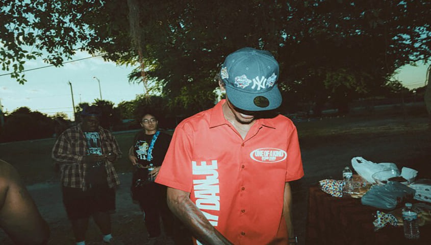
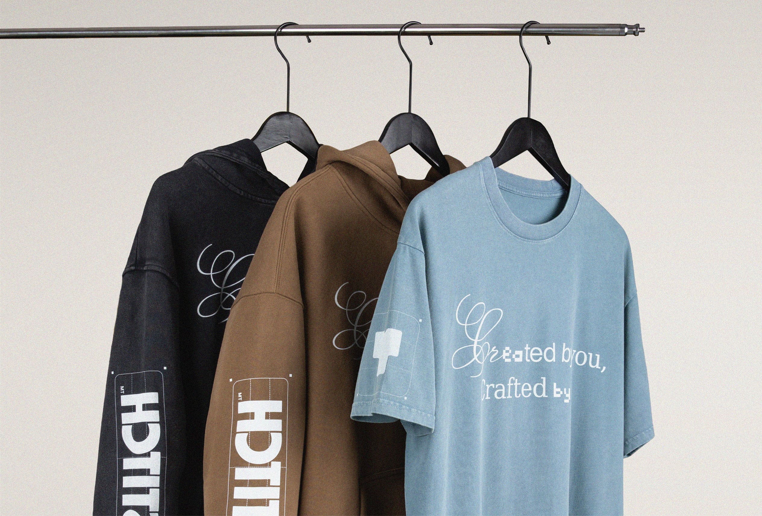
Full Front → The headline act. At 11"–12" wide on adult tees, this is statement territory. A walking poster. Bold illustrations, collabs, or graphic-heavy drops—your design size for shirts maxed out.
Back Placements
Upper Back → Just below the neckline. Common for team names or smaller logos on custom apparel. Subtle flex.
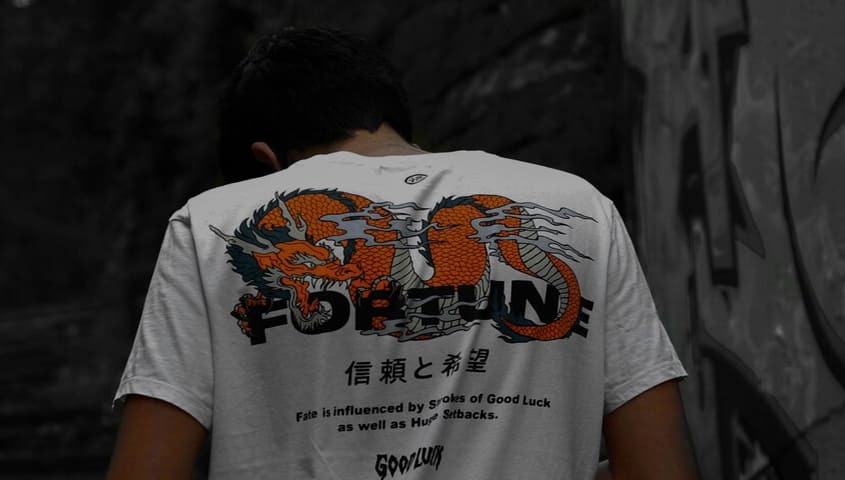
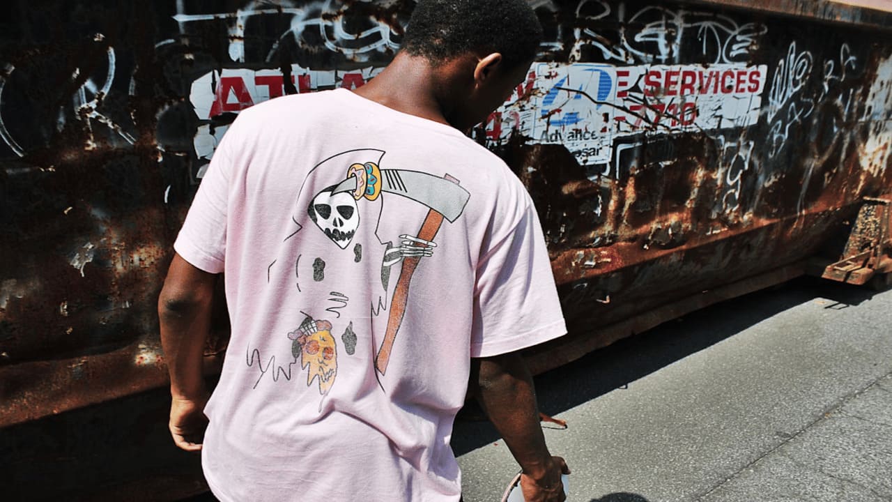
Full Back → A canvas that can carry oversized artwork. Best when the front stays minimal.
Sleeve Placements
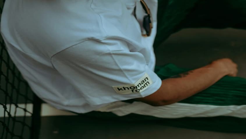
Standard Sleeve → About 2"–3" tall. Perfect for flags, icons, or secondary branding.
Shoulder/Cuff → More streetwear, less uniform. Often used in limited drops, the “if you know, you know” placement.
Other Creative Zones
Yoke (Upper Shoulders) → A quiet detail that pairs well with larger front/back designs.
Hip/Bottom Corner → Minimal but unexpected. A designer’s wink.
Vertical Prints → Running down the spine or side—one of 2026’s trendiest moves.
Wrap-Around → Artwork that spills from front to side to back. Tricky to align, but when it hits, it hits.
Choosing the zone isn’t random—it’s a strategy. A design size for shirts that works on a fashion-forward oversized back print isn’t the same as the clean precision of a logo size for shirts on the chest. Placement is part of the flow, the rhythm, the verse—get it right, and every t-shirt feels intentional.
Design Size for Shirts: Finding the Right Scale
The same artwork can feel like a fashion piece or a novelty gag depending on scale. That’s why the design size for shirts matters just as much as placement. Size it right, and your print feels intentional—like it belongs to the garment. Overshoot, and it may resemble a giveaway t-shirt from a trade show.
Adult Sizes
Full Front → 11"–12" wide is the technical ceiling. It maxes the canvas without wrapping it into the side seams. But the stylish sweet spot? More like 10"–11", leaving negative space for balance.
Youth Sizes
Full Front → 8"–9" wide keeps proportions sharp. Anything bigger starts to swallow the shirt, especially on shorter youth cuts.
Toddler Sizes
Full Front → 5"–6" wide is plenty. Oversize a toddler t-shirt, and suddenly the design wears the kid, not the other way around.
Chest Logos → 2.5"–3" is the magic range for that clean, scaled-down look.
Rule of Thumb
Aim for prints around 70% of the shirt’s total width. That ratio works across sizes, keeping designs consistent and wearable.
Maximum Safe vs. Stylish Sweet Spot
- Adult full front → 11" × 11" max / ~10" × 10" recommended
- Youth full front → 9" max / ~8" recommended
- Toddler full front → 6" max / ~5" recommended
Scaling properly is the difference between a tee that looks tailored for every cut and one that feels like a copy-paste job. Get the design size for shirts right, and your brand identity carries clean across adults, youth, and toddlers—polished across the board.
Tiny Print, Big Vibes: Nailing the Perfect Logo Size for Shirts
Logos aren’t just graphics—they’re signatures. The logo size for shirts decides whether your brand whispers premium or shouts promo. Scale it right, and the mark feels intentional. Miss it, and it either fades into the fabric or hijacks the whole shirt.
Left Chest Logos
The industry gold standard: 3.5" × 3.5". Big enough to read, small enough to keep it discreet. On youth cuts, drop to ~3" to keep proportions sharp. This is the “quiet luxury” of placements—subtle, timeless, and endlessly wearable.
Centered Logos
When the logo is the design, put it front and center. 8"–10" wide on the chest gives it presence without swallowing the shirt. For text logos, leave breathing room so the lines don’t choke the design. Graphics can run a little tighter and still hold clarity.
Small vs. Large Branding
- Small logos → Minimal, fashion-forward. Think Supreme’s box logo: tiny print, massive influence.
- Large logos → Loud, unapologetic. Works for collabs, statement drops, or when the logo itself is the graphic. Overdo it, though, and it risks looking like swag merch.
Visibility Check
Logos live on different scales. A 3.5" chest mark nails close-up interaction, while a 10" center logo catches eyes across a room. Match the logo size for shirts to context—quiet flex for everyday rotation, bold marks for designs that demand attention.
Measure Twice, Print Once: Positioning Rules That Don’t Miss
Even the best design falls flat if it’s crooked, off-center, or floating too high. That’s why every legit t-shirt design placement guide starts with one rule: measure from collars, seams, and center lines. Consistency is what turns a one-off print into a collection—and it’s how the right design size for shirts stays locked in across every blank.
Front Placements
Center Chest → Start 3"–3.5" below the collar edge. High enough to read, low enough to breathe.
Full Front → Same top margin (3"–3.5" down), centered horizontally for balance.
Left Chest Logos
Standard fit: 7"–9" down from the shoulder seam, 4"–6" over from the center line.
Smaller sizes: Scale to ~5.5"–7" down, 3.5"–4.5" over.
This is where the logo size for shirts proves itself—sharp, repeatable, versatile.
Back Placements
Upper Back Logo → 2"–3" below collar.
Full Back → Start 3" down, filling the width without bleeding into the sleeves.
Sleeves
1" above the hem or 1" below the shoulder seam, aligned to the sleeve fold. Keeps the graphic upright when worn—no accidental tilt.
Consistency Hacks
Work from seams → Always measure from fixed points, not fabric edges.
Use templates → Alignment tools keep placements uniform across sizes.
Check balance → Fold vertically before pressing to confirm dead-center alignment.
A crooked logo is the fastest way to kill brand credibility. Perfect placement keeps every tee clean, intentional, and fashion-ready—never slipping into cheap merch territory.
Ink, Thread, Heat: Placement Plays by the Rules of Print & Fabric
A placement that kills on one shirt can flop on another. Why? Because every print method and fabric type has its own limits. A true t-shirt design placement guide doesn’t just show where to put a design—it shows how to make it work with the tech and the textile.
Printing Methods
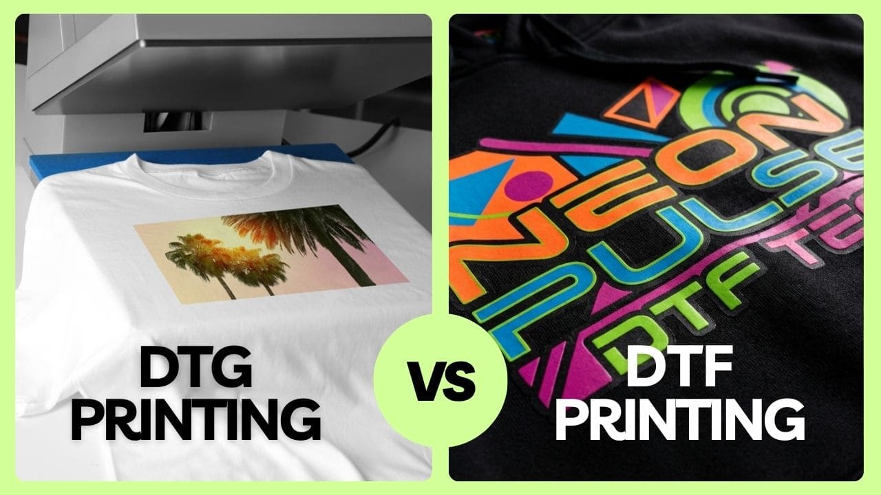
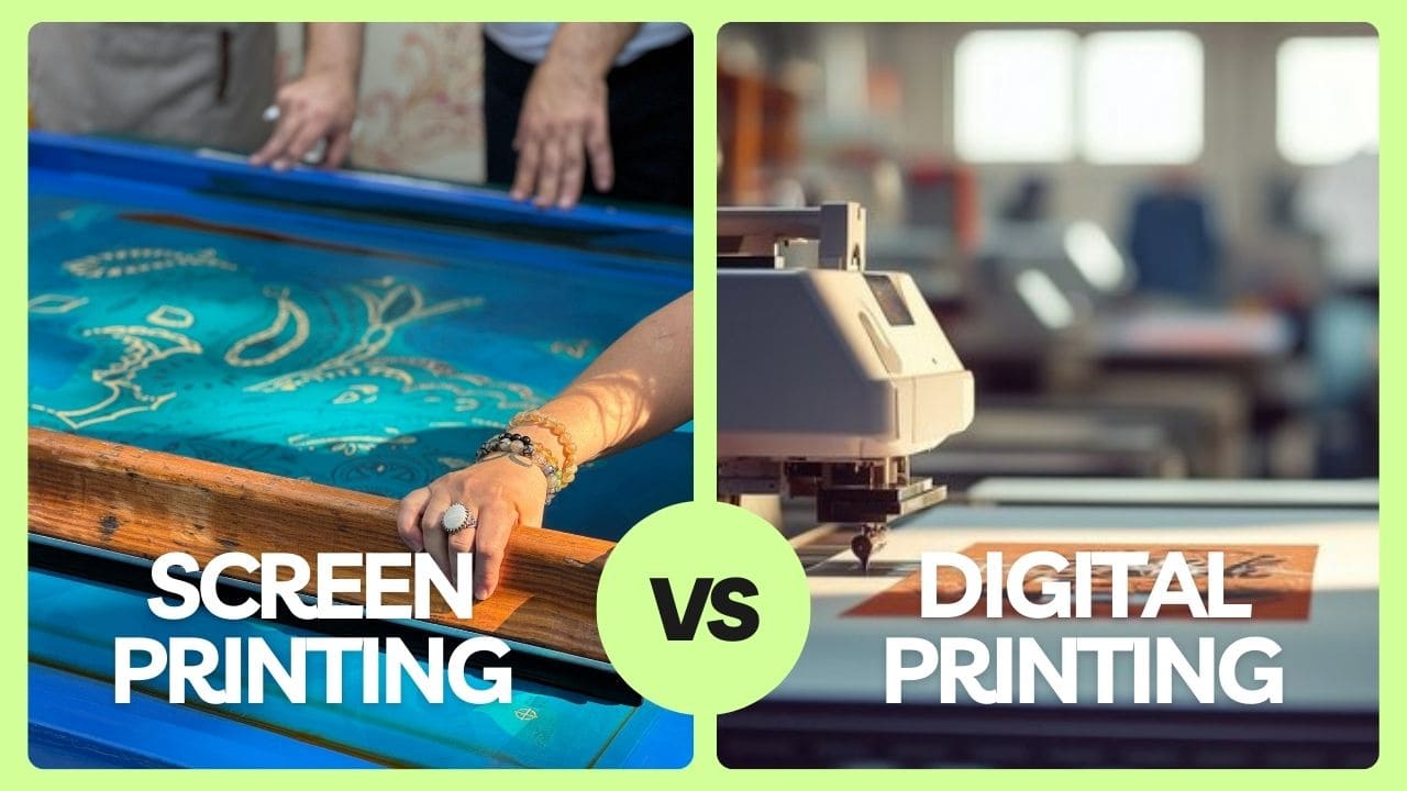
DTG (Direct-to-Garment) → Handles detail and gradients like a pro. But keep it away from seams or collars—the uneven surface breaks the print. Think of vintage-style tour tees with washed-out gradients—that’s DTG’s sweet spot.
Screen Printing → Bold, durable, built for repetition. Works across most zones, though oversized prints on ribbed or seamed fabrics may crack. Classic band merch and ’90s skate tees leaned on screen printing for that bold, high-contrast impact.
Embroidery → Heavy flex, but keep it small. Best logo size for shirts, if it's on the chest or sleeves. Ralph Lauren’s pony or Carhartt’s stitched square patch proves how a tiny embroidered logo can carry an entire brand. Go oversized, though, and embroidery distorts the fabric.
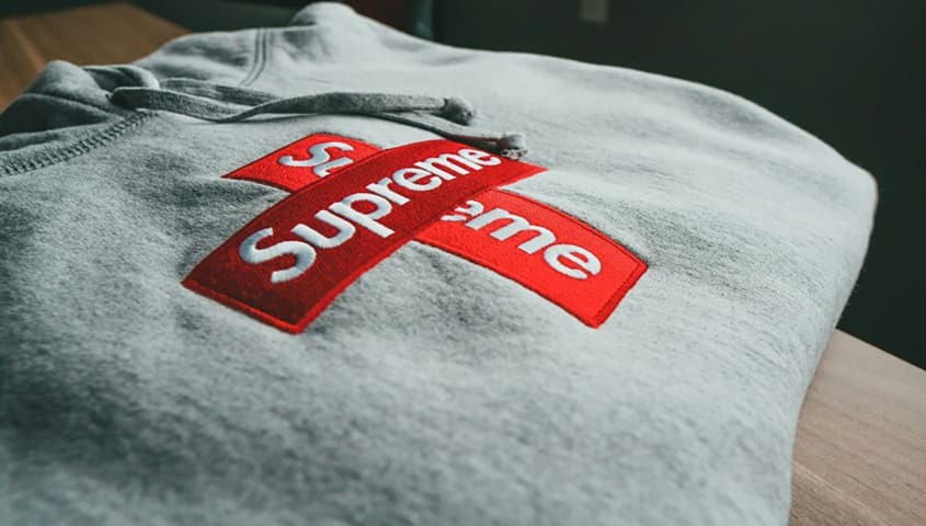
Heat Transfer/Vinyl → Crisp, exact, and made for sharp logos. Supreme’s box logo in vinyl is the blueprint: small, clean, instantly recognizable. Just avoid seams and collars—those zones peel fast.
Fabric Considerations
V-Necks → Drop the design lower to leave breathing room from the neckline.
Oversized Fits → Bigger blanks = slightly larger graphics or higher placement to keep designs from sagging. Streetwear brands like Fear of God Essentials adjust scale constantly for oversized cuts.
Stretch Fabrics → Keep graphics smaller; large prints can warp. Performance brands like Nike and Under Armour often rely on smaller logos for this reason.
Heavy Seams → Test wrap-arounds or side prints first. Thick seams can split designs, so plan accordingly.
Takeaway: Placement isn’t just about style—it’s about respect. Respect the method, respect the fabric, and your design size for shirts will always land right, whether you’re going for a luxury logo flex or a bold streetwear drop.
2026 Trends in T-Shirt Placement Styles
Placement isn’t static—it shifts with culture. In 2026, the way designs sit on a shirt is as trend-driven as the artwork itself. A visionary founder knows: staying current isn’t about chasing hype, it’s about understanding how design size for shirts and placement set the tone of a collection.
Asymmetry as Attitude
Designs nudged just off-center are dominating streetwear. Push a graphic toward the right or left chest, and it instantly feels experimental—think Off-White’s diagonal energy but simplified for tees. It’s a subtle rebellion, the difference between “basic” and “fashion.”
Vertical Side Prints
Artwork running down the spine or side seam turns a t-shirt into a moving canvas. Vertical text elongates the body, while graphics add motion. This is where avant-garde drops live—the kind of placement you’ll spot in A-COLD-WALL* or Y-3 collections.
Sleeve Storytelling
The sleeve print is no longer an afterthought. Wrapping text, icons, or patterns around the arm creates subtle details that appear when the wearer moves. Streetwear brands like Stüssy and Palace are already using sleeves as secondary canvases for layered fits.
Minimalist vs. Oversized Branding
Minimalist marks → 3" chest logos, clean and premium. Supreme’s box logo proves how small can feel monumental.
Oversized graphics → 11"–12" fronts and bold backs, engineered for social feeds. Travis Scott tour merch and Balenciaga both thrive here.
Social Media-Driven Placement
TikTok and Instagram don’t just spread designs—they shape them. Wrap-around prints that catch movement on video, asymmetrical logos that pop in mirror selfies—these placements spread fast and set trends.
Placement isn’t just technical—it’s cultural currency. A founder who reads the shifts can keep their shirt placement guide rooted in sizing best practices while still looking like 2026, not 2015.
Placement Crimes: The Mistakes That Kill Your Design
Even the strongest artwork won’t save a tee if the placement feels off. These are the repeat offenses that downgrade a shirt from “brand-worthy” to “trade show giveaway.”
Too Low or Too High
Cramming a print against the collar makes it suffocate. Drop it too low, and it drifts into the stomach zone—nobody asked for a belly print. The sweet spot: 3"–3.5" below the neckline for most front placements. That’s the backbone of any shirt placement guide.
Forgetting to Scale Down
An 11" design size for shirts looks clean on adults, but on a youth t-shirt, it swallows the whole cut. Rule of thumb: shrink to ~70% of the shirt width for balance across age brackets.
Crossing Seams and Folds
Wrap-arounds and side prints look bold in theory, but if they land over seams, they crack or break once worn. Always sample test—fabric drape is real.
Overcrowding the Canvas
Just because you can print everywhere doesn’t mean you should. Multiple logos on front, back, sleeves, and hem = visual chaos. Fashion breathes through negative space. A single well-placed logo size for shirts will outclass a tee drowning in graphics.
Bottom line: Placement is balanced. Get the size, the spot, and the breathing room right, and every tee feels intentional—like it belongs in a collection, not a conference swag bag. And with Tapstitch’s no MOQ, testing is cheap—try one placement, see if it slaps, try another. That’s how you find the fit your brand deserves.
Quick Reference: T-Shirt Placement Cheat Sheet
Use these measurements as your go-to starting point for shirt designs.
Quick rules to remember
- Keep designs about 70% of the shirt width for balance.
- Always scale down for youth and toddler cuts.
- Measure from seams and collars, not fabric edges.
- Leave breathing room—designs too close to collars or hems feel crowded.
This cheat sheet keeps placement consistent while leaving space to experiment—whether you’re chasing 2026’s asymmetrical trend or testing your next oversized drop.
Placement as Brand Strategy
This t-shirt design placement guide proves that the right design size for shirts and the right logo size for shirts aren’t technical footnotes—they’re branding moves. Placement is the line between merch that gets worn once and fashion that people actually style.
Testing matters. A mockup can lie; a sample tells the truth. Try placements across sizes, layer them, wash them—see how they live in real life.
Tapstitch makes that process easy. With fashion-first blanks, no MOQ, and full packaging, you can experiment freely and scale with confidence. Placement is strategy, and with the right tools, every shirt you drop looks intentional.


.jpg)


.jpg)

.png)
.jpg)


.jpg)
.jpg)


.jpg)
.jpg)
.jpg)
.jpg)
.jpg)

%20(1).jpg)

.png)

.png)


%20(1)%20(1).jpg)


.png)
.png)


.jpg)

.jpg)
.jpg)

.png)


.png)


.png)
.png)


.png)


Inspiration Starts Here. Let's Make Something Beautiful.
Make high quality clothes easily with Tapstitch.